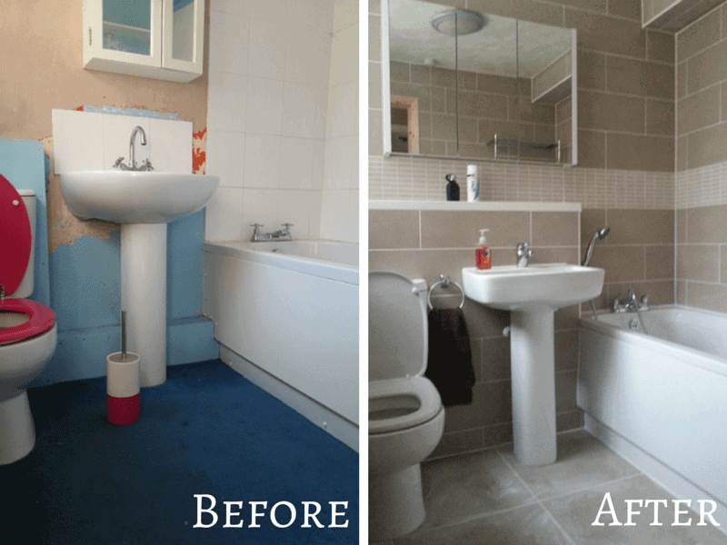
It seems like such a long time since I first mentioned about our bathroom renovation, when in fact it was only back in July. I have to admit that pressing the publish button on that post was hard for me. I opened my awful bathroom up to the world, not just the few visitors that come to my house and find themselves caught short. I was ashamed for you all to see what a state my bathroom facilities were, with it’s cracked basin, carpeted floor, stupid boxing in behind the toilet, the list goes on.
Almost two months later and our family bathroom looks completely different… and I’m so very proud to show it off!

The renovation didn’t go as smoothly as we had hoped as our plumber was delayed on another job which meant he started later. As our soil pipe was going to be too costly to move we opted to live with the fact that our toilet would sit away from the back wall. Instead of that awful boxing in that was there previously we opted to incorporate it in to the bathroom design and made it in it a usable shelf area above the toilet and basin. Personally I don’t think it looks too bad and we made it the same height as the window sill so that flowed around the corner.
With a few misunderstandings on what we wanted, tied into me being back at work and not around to relay my wishes resulted in a few assertive emails being sent from myself to the plumber. Thankfully we managed to resolve the issues and things were changed to how we had requested them during the quotation.
Bathroom Suite
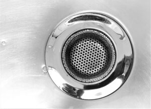
The bathroom suite we chose was just a basic one from a builders merchant but I think it looks 100 times better than the previous one we had. Although I don’t love the plughole/drainage on the basin as it is one of the pull a lever behind the tap to open/close which is a little difficult for Roo to use.

Tiles
I have to say that my favourite thing about our new bathroom is the tiles. I was so pleased that I took the time to research different tiles, colours, sizes and layout combinations. The border tile which is same size as a regular tile really adds that something extra to the room, making it appear much larger than it actually is.
Accessories
With such a small bathroom we were conscience not to fill it up too much so opted for a minimalist slimline bathroom cabinet with large mirrored doors. Inside the cabinet you can only store things one deep on the shelves but actually this is much better as you can see at a glance what you have in there rather than rooting at the back for something.
Removing our old towel storage unit has really opened up the floor space, making the room feel bigger and brighter. Hanging a wall mountable towel rail above the bath has allowed us to have a range of towels within easy reach but it also incorporates a shelf to store bulky items like toilet paper etc. out of the way of little fingers.

The finishing line
We’d not 100% finished, but I’d say a good 98%. We just need to paint the door and architrave and possibly replace the light fitting but other than that we’re finished.
What do you think of my new bathroom?


No Comments