The drama of navy blue or the fresh appeal of sunshine yellow, there are all kinds of colours, shades, and hues to choose from. But making them work in your home is not easy… but it is now with this fantastic how to choose the right colour for your home guide from Balustrade Components!
#1 Choose the colour(s) from the largest pattern or object in the room
When it comes to decorating a room, unless you are going for a completely new look, you will probably need to work with items that are already in the space, such as a carpet, an expensive rug or maybe the sofa.
Start the process of choosing new wall colours by opting for a colour that complements the main colour of the largest object or pattern in the room. For example, if your expensive rug has red, beige and navy in it, use a colour that will pick out one of these, such as a navy patterned wall paper.
#2 Use dark to light colours vertically
So, the blue carpet is dark, the walls a lighter blue and the ceiling white or a very light blue if you feel that way inclined (don’t forget, a colour on the ceiling with make it appear closer and that’s why designers suggest using colours on ceiling only when a room has generous head height).
#3 The hallway, living area, and dining room set the tone
And so, when it comes to decorating your entire home, start with these three areas and work out from there. The entry hallway sets the tone for the whole house and you will show guests into the living room and possibly host the odd dinner party or two. Once you have these colour schemes defined, use colours from them to complete the remainder of your home.

#4 Use the colour wheel
Fourth on our whistle-stop tour of how to decorate your home is using the colour wheel. Colours that are next to each other on the colour wheel – such as blue and green – work well together to create a relaxing environment. Consider neighbouring colours on the wheel for bedrooms to promote rest and recovery.
#5 Add a note of black
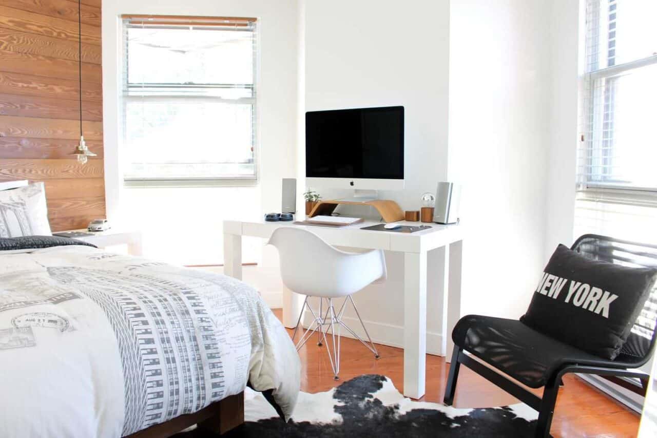
Graphic designers have long known the power of black for outlining and emphasising key points in a design. And interior designers also suggest adding a little black into every colour scheme in individual rooms too. It can be anything from a few black cushions in the living room, to black cupboards doors in the kitchen. add a dash of elegant black and note the subtle transformation.
#6 Favour neutral shades? Opt for grey
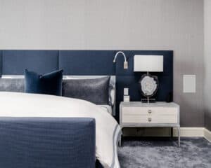
Not everyone wants colour, colour, colour spread across the home but if you feel that beige and magnolia are too anonymous and predictable, opt for neutral and light toned greys instead. For a sprinkle of colour, consider mauve in the master bedroom.
#7 The 60-30-10 rule
To help get the colour balance right, follow this deceptively simple rule:
- 60% should be the dominant colour e.g. the walls
- 30% should be the secondary colour e.g. the upholstery
- 10% is the accent colour e.g. the accessories such as cushions and throws.
#8 Add a ‘look at me colour’!
When you have a small space, the only solution that seems available is to paint it white. But say designers, throw out the rule book and add a ‘look at me colour’ on one wall or across all walls if you are feeling particularly courageous. Add mirrors to soften the effect and to bounce light around for dramatic effect.

#9 Mix warm and cool
Neutrals don’t have to be cold. Soften their chill with a warm colour, such as mustard yellow with grey. Don’t be frightened to try new things.
#10 Opt for a monochromatic look
Monochrome is the pairing of the traditional white and black – great in so many homes – but this is about the monochromatic look. And that means pairing white with another colour. White can make a darker colour seem a little lighter so don’t be frightened to go a shade or two darker on the contrasting colour than you normally would. For example, don’t just opt for dark green and white, opt for forest green and white, and rock the two colours throughout the whole space. Works great in a modern home or try it in the bathroom to see how it feels.
Colour is nothing to fear when it comes to decorating your home. And sometimes, pushing the boundaries and breaking the rules creates stunning effects.

Featured Article – Balustrade Components have helped domestic and business customers to transform their interiors with amazing glass balustrades and staircases. And their products have transformed exteriors too!
Photo Credit: Nathan Fertig Gabriel Beaudry Benjamin Voros


No Comments